Website accessibility issues related to keyboard navigation are among the most common and most overlooked problems on the modern web. When users who rely on keyboards, screen readers, or assistive devices visit your site, broken tab order, missing focus indicators, and inaccessible interactive elements create genuine barriers.
These aren't edge cases; they affect people with motor disabilities, temporary injuries, power users who prefer keyboards, and anyone using assistive technology. Fixing these problems improves usability for everyone and moves you closer to WCAG compliance.
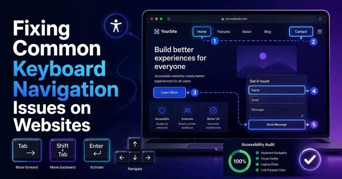
This guide walks you through the specific, practical fixes that eliminate keyboard navigation barriers on your web projects. If you've already started auditing your site, the steps below will complement what you've found. For a broader look at identifying and resolving accessibility problems across your pages, our guide on finding and fixing website accessibility issues covers the full picture.
Key Takeaways
- Every interactive element on your site must be reachable and operable by keyboard alone.
- Visible focus indicators are required by WCAG and should never be removed with CSS.
- Custom widgets need explicit ARIA roles, keyboard event handlers, and proper tab management.
- Testing with Tab, Shift+Tab, Enter, and arrow keys catches most keyboard navigation problems fast.
- Skip navigation links save keyboard users from tabbing through dozens of repeated elements.
1. Identify Keyboard Traps and Tab Order Problems
Finding Keyboard Traps
A keyboard trap occurs when a user can tab into an element but cannot tab out of it. This is a direct violation of WCAG 2.1 Success Criterion 2.1.2, which requires that keyboard focus can always be moved away from any component.
Common culprits include embedded media players, third-party widgets like chat overlays, and poorly coded modal dialogs. To identify traps, open your site, put your mouse aside, and try navigating every page using only the Tab key.
When you find a trap, the fix depends on the cause. If a third-party embed is trapping focus, check whether the vendor provides an accessible version or configuration option. For custom code, make sure every focusable container has a clear exit path typically by handling the Escape key event to return focus to the triggering element. Never leave users stranded inside a component with no way to leave via keyboard.
A single keyboard trap can make an entire page unusable for keyboard-only users — treat these as critical bugs.
Fixing Tab Order
Tab order should follow the visual and logical reading order of your page. When developers use CSS to reposition elements through flexbox order, grid placement, or absolute positioning, the DOM order and visual order can diverge. A screen reader or keyboard user then encounters content in a sequence that makes no sense. The fix is straightforward: restructure your HTML so the source order matches the intended reading flow, rather than relying on CSS to rearrange things visually.
Avoid using positive tabindex values like tabIndex="2" or tabIndex="5". These override the natural DOM order and create maintenance nightmares. The only tabindex values you should use are 0 (to make a non-interactive element focusable in DOM order) and -1 (to make an element programmatically focusable but not in the tab sequence). When building pages with an HTML website builder, verify that the generated markup maintains a logical source order.
2. Restore and Enhance Focus Indicators
Why Focus Styles Get Removed
The most widespread keyboard accessibility issue on the web is the removal of focus outlines. Developers add *: focus { outline: none; } to their stylesheets because they think the browser's default focus ring looks ugly. This single line of CSS renders a site nearly unusable for keyboard users because they can no longer see where they are on the page. WCAG 2.4.7 requires a visible focus indicator on all interactive elements.
Removing focus styles is like removing the cursor from a mouse interface; users lose all spatial awareness. Some design teams argue that the blue outline clashes with their brand. That's a valid aesthetic concern, but the solution is never removal. It's replacement with a custom style that meets both design requirements and accessibility standards. Your brand can absolutely have a distinctive, attractive focus style.
CSS :focus-visible lets you show focus rings only for keyboard users, not mouse clicks — it's widely supported in modern browsers.
Building Better Focus Styles
A good custom focus indicator uses high contrast, sufficient thickness, and enough offset to be visible against any background. WCAG 2.4.13 (Level AAA in 2.2) recommends a minimum 2px solid outline with a 3:1 contrast ratio against adjacent colors. A practical approach is a 3px solid outline in a brand-appropriate color, with an outline-offset of 2px so it doesn't overlap the element. Test the indicator against both light and dark sections of your page.
"If your users can't see where keyboard focus is, every other accessibility fix you've made is undermined."
For elements that already have a visible border, consider using a box-shadow for the focus state. This avoids layout shifts that outlines can sometimes cause. Apply:focus-visible rather than: focus to prevent showing outlines on mouse click events while still supporting keyboard navigation. Test across browsers, because focus rendering differs between Chrome, Firefox, and Safari. Each handles outline rendering slightly differently around elements with border-radius.
3. Make Custom Components Keyboard Accessible
Dropdowns and Menus
Native HTML elements like <button>, <a>, and <select> come with built-in keyboard support. When you build a custom dropdown using <div> elements and JavaScript click handlers, none of that built-in behavior exists. The dropdown won't respond to Enter or Space keys, arrow keys won't cycle through options, and screen readers won't announce the component's role. You need to add all of this manually using ARIA attributes and keyboard event listeners.
For a custom dropdown menu, assign role="menu" to the container and role="menuitem" to each option. Manage focus with the arrow keys: down arrow moves to the next item, up arrow moves to the previous one. Escape should close the menu and return focus to the trigger button. Use aria-expanded="true/false" on the trigger to communicate the state. This pattern, documented in the WAI-ARIA Authoring Practices, applies to navigation menus, action menus, and select-like components.
Whenever possible, use native HTML elements instead of custom components — a styled button beats a clickable div every time.
Modals and Dialogs
Modal dialogs present a unique keyboard challenge: focus must be trapped inside the modal while it's open, then returned to the triggering element when it closes. This is the one place where a "focus trap" is actually the correct behavior. Without it, users tab behind the modal into page content they can't see, creating confusion. Implement a focus trap by intercepting Tab on the last focusable element and redirecting focus to the first, and vice versa with Shift+Tab.
Set role="dialog" and aria-modal="true" on the modal container. Use aria-labelledby pointing to the modal's heading so screen readers announce its purpose immediately. When the modal opens, move focus to the first interactive element inside it, usually a close button or the first form field. When it closes, return focus to the element that triggered it. The HTML <dialog> element handles much of this natively and has strong browser support now.
4. Implement Skip Links and Test Thoroughly
Adding Skip Navigation
Skip navigation links let keyboard users jump past repeated content blocks typically the site header and main navigation and land directly on the page's primary content. Without a skip link, a keyboard user must tab through every navigation item on every single page load. On a site with 15 nav links, that's 15 presses of Tab before reaching any actual content. WCAG 2.4.1 requires a mechanism to bypass blocks of repeated content, and a skip link is the most common solution.
The implementation is simple. Place an anchor link as the first focusable element in your page: <a href="#main-content" className="skip-link">Skip to main content</a>. Add a matching id="main-content" to your main content area. Style the skip link to be visually hidden by default, then make it visible on focus using CSS. Position it at the top of the viewport on focus so sighted keyboard users can see it. This takes about five minutes to implement and dramatically improves keyboard usability.
Add tabIndex="-1" to the skip link target if it's not a natively focusable element, so focus actually moves there in all browsers.
Manual and Automated Testing
Automated testing tools catch some keyboard issues, missing ARIA roles, elements without focus styles in the computed stylesheet, and certain tab order anomalies. But they cannot detect keyboard traps, illogical focus movement, or whether a custom widget actually works with arrow keys. Manual testing with a real keyboard remains essential. Unplug your mouse, start at the top of the page, and tab through everything. Note where focus disappears, where it gets stuck, and where the order feels wrong.
Combine manual keyboard testing with screen reader testing using NVDA (free on Windows), VoiceOver (built into macOS), or TalkBack (Android). Screen readers interact with keyboard focus differently than a sighted keyboard user does, and testing with both perspectives catches more problems. Run these tests on every new component before it ships, not just during periodic audits. Building keyboard accessibility testing into your development workflow prevents regressions and keeps your site usable for everyone.
Common Keyboard Issues Reference
| Issue | WCAG Criterion | Fix | Priority |
|---|---|---|---|
| Keyboard trap in widget | 2.1.2 No Keyboard Trap | Add Escape key handler to release focus | Critical |
| Missing focus indicator | 2.4.7 Focus Visible | Replace removed outlines with custom :focus-visible styles | Critical |
| Non-focusable interactive element | 2.1.1 Keyboard | Use native HTML elements or add tabIndex="0" and key handlers | High |
| No skip navigation link | 2.4.1 Bypass Blocks | Add visually hidden skip link as first focusable element | High |
| Illogical tab order | 2.4.3 Focus Order | Restructure DOM to match visual layout; remove positive tabindex | Medium |
| Modal without focus trap | 2.1.2 / 2.4.3 | Implement focus cycling within modal; return focus on close | High |
Frequently Asked Questions
?How do I quickly test for keyboard traps on my website?
?Is restructuring HTML always better than using tabindex to fix tab order?
?How long does fixing keyboard navigation issues typically take?
?Will removing focus styles with CSS only affect screen reader users?
Final Thoughts
Keyboard navigation accessibility isn't a nice-to-have, it's a fundamental requirement for any website that claims to be usable. The fixes outlined here are specific, well-documented, and most take less than an hour to implement per component.
Start with the critical issues: eliminate keyboard traps and restore visible focus indicators. Then work through custom components, skip links, and thorough manual testing. Every fix you ship makes your site more accessible to the people who need it most.